One of the joys of nature journalling is learning to see colour in a new way. When we first open a box of watercolours or coloured pencils, the neat rows of hues feel like a promise: all the colours of the world, ready to be drawn.
But as soon as we step outside, journal in hand, it becomes clear that the colours of nature rarely match the bright, standardised pigments provided in commercial sets. In the Australian landscape, we are met with olives, silvers, ochres, and muted tones softened by dust and sunlight, which shift constantly with season, light, and weather.
More than just ‘Green’
Perhaps nowhere is this difference more striking than in foliage. A paint labelled “sap green” or a pencil called “leaf green” will give you something bright and serviceable. But look closely at the bush and you’ll see that Australian greens are rarely that simple.
New growth may glow with yellow-lime freshness. Mature leaves settle into dusty olives and grey-greens. Grasses often carry bronze or ochre tinges. Shadows lean blue or almost black under the midday sun.
“No single paint or pencil can capture nature’s greens; it’s the mixing and layering that brings them to life.”
Why Palettes Differ from Nature
Watercolour sets and coloured pencil ranges are designed for reliability and versatility. They give us strong, consistent colours, but nature is never so uniform. A patch of moss glows bright when damp, then dulls as it dries. A leaf looks different in morning sun, afternoon haze, or after rain.
Rather than being a frustration, this is an invitation. Nature journalling encourages us to look beyond what’s printed on a label, and instead to train our eyes and our hands to follow what we truly see.
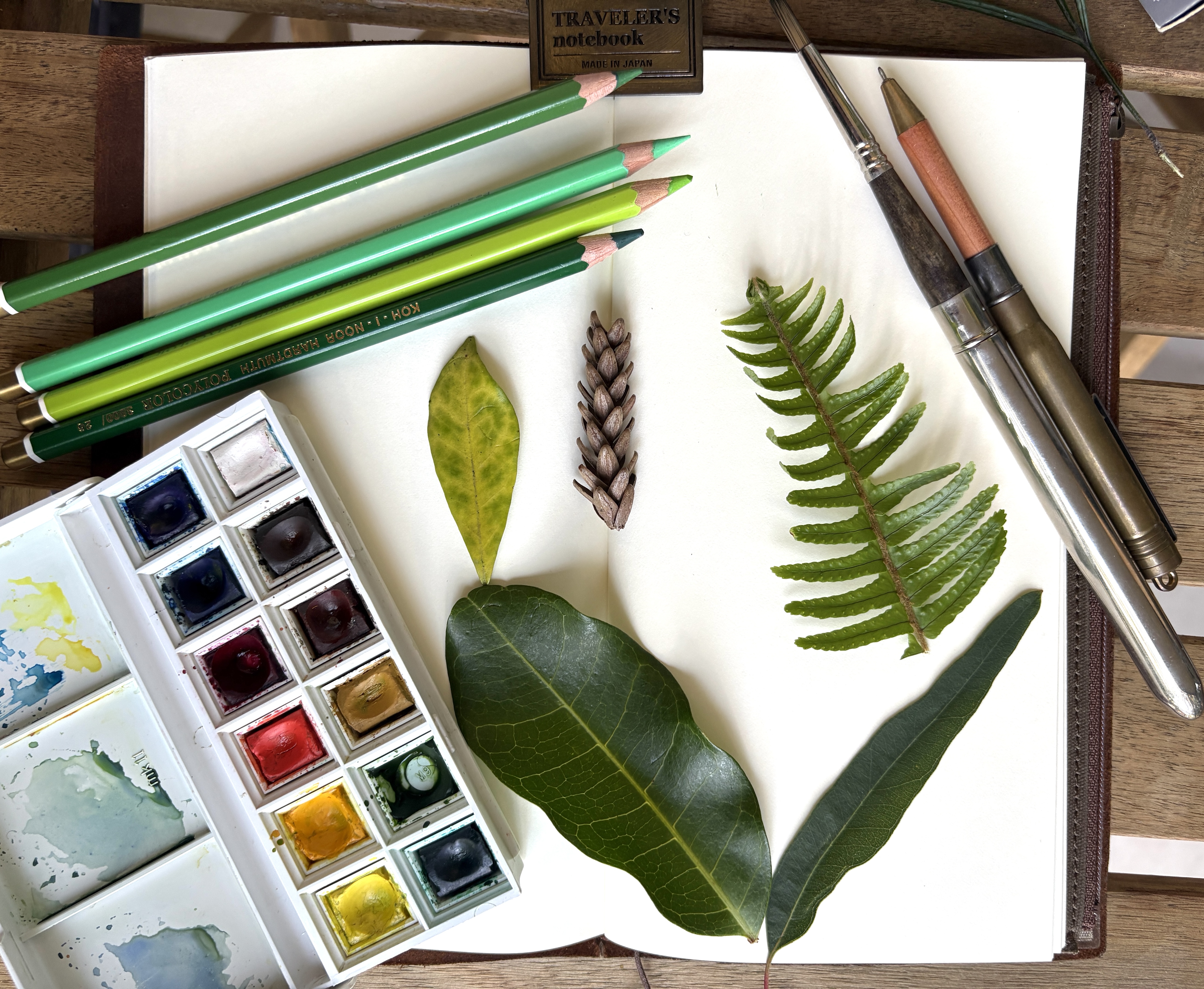
Recording Colours in the Field
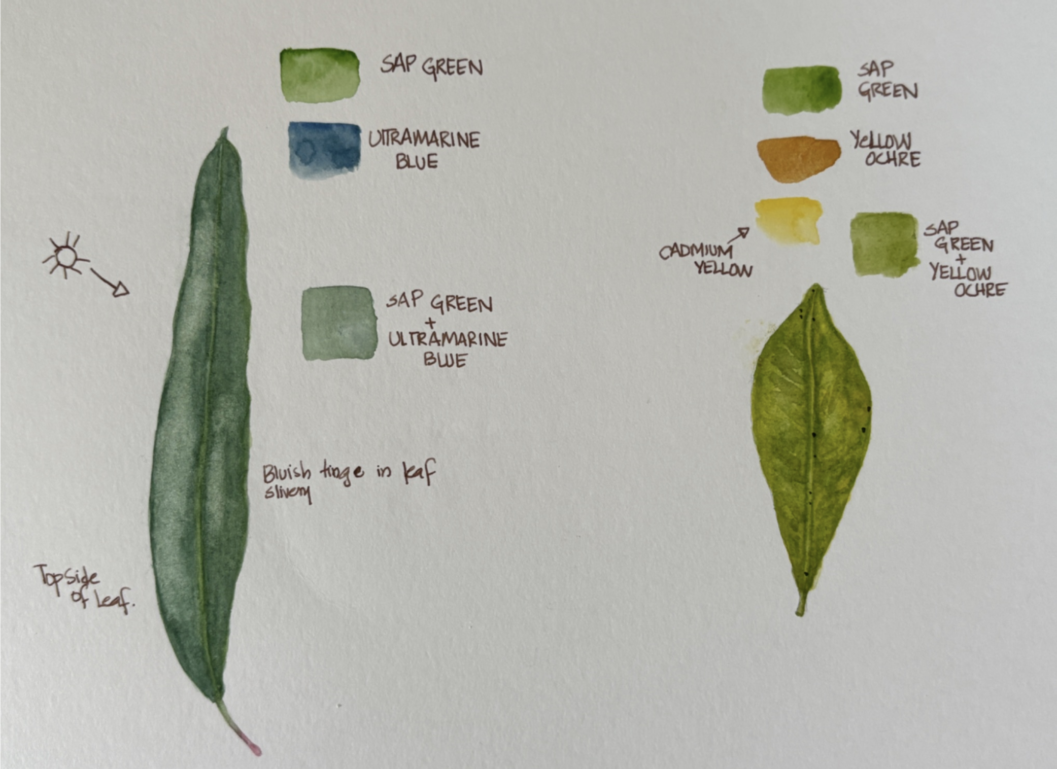
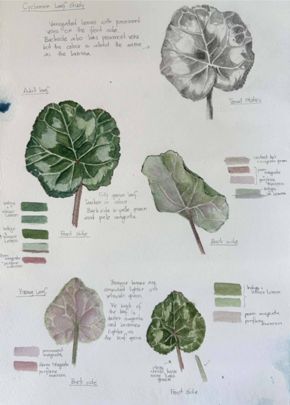
A simple way to begin is to swatch a single leaf or blade of grass. Record the sunlit side, the shaded underside, and the stem. Add short notes beside your swatches: “silvery underside,” “dusky olive edge,” “yellow highlight at tip.”
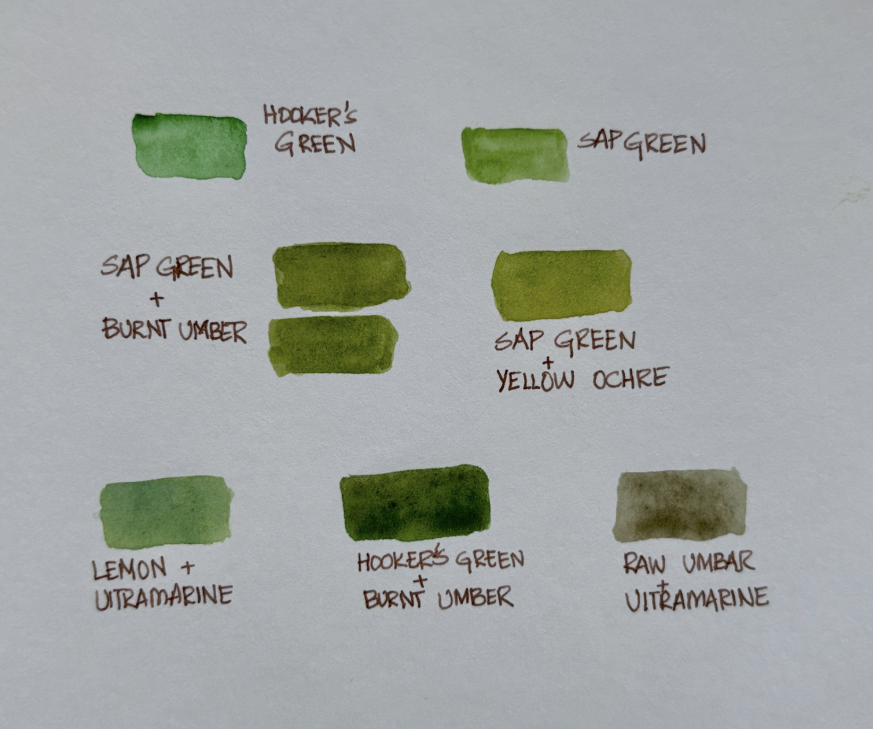
- Watercolourists: Glaze sap green with Raw Umber, Burnt Sienna, or Ultramarine to create more natural tones.
- Coloured pencil users: Layer lemon yellow under olive green, or soften chartreuse with grey for foliage that feels true.
"Attending to these quiet variations helps us tune in to the character of the land itself.”
Building Your Own Palette
Over time, every journaller develops a personal “nature’s palette”. In Australia, this often means favouring muted olives, ochres, and greys over the brighter greens of European landscapes. Watercolourists might rely on Quinacridone Gold, Burnt Sienna, French Ultramarine, and Perylene Green. Pencil users may reach for Olive Green, Warm Grey, Indigo Blue, and Ochres to layer subtle combinations. Your palette evolves with place and season. By keeping swatches and notes in your journal, you slowly build a record not only of colours,but of the land itself.
The Art of Seeing
Nature journalling is not about perfect matches. It is about slowing down, looking closely, and recording what you notice. The Australian landscape reminds us daily of this truth: its greens are softened by silver, its grasses lean towards ochre, and its skies fade into blue-grey. These colours may be quieter than those in our paintboxes, but they speak with a depth that invites us to honour them on the page.
Quick Exercises for your next outing:
- Swatch one leaf: Record both the top and the underside.
- The 2x2 Challenge: Mix two yellows and two blues to create a custom green chart.
- Light Study: Observe the same tree in morning and evening light and note the shift.
- Earth Tones: Practice adding earth tones (Sienna/Umber) to soften bright "out of the box" greens.
Market Colours vs. Nature’s Greens
Here are some suggestions to mix nature’s greens. This is by no means a complete list, and you are encouraged to experiment with your own unique combinations.
| Market Colour | Straight from the Box | Adapt for Nature |
|---|---|---|
| Sap Green | Bright mid-green | Add Burnt Umber/Burnt Sienna → olive; Yellow → fresh |
| Leaf Green (pencil) | Strong, artificial | Mix with Warm Grey or Ochre |
| Hooker’s Green | Intense | Add Burnt Umber for a muted, deep green |
| Olive Green | Muted, earthy | Add Yellow → sunlight; Grey → shadow |
A Note on Experimentation: The Australian bush is particularly fond of "grey-gold" and "silvery-olive" tones. Try adding a tiny touch of Ultramarine Blue or Payne's Grey to your Sap Green to see how it captures that eucalyptus shimmer.