There was a time when I thought green should be easy.
After all, green is everywhere. It is the colour of leaves, grass, trees, stems, moss, weeds, garden edges and bushland paths. Surely, if there was one colour that should come naturally to anyone painting plants, it would be green.
But the more I painted, the more I realised that green is not one colour at all.
In fact, green may be one of the most difficult colours to understand, especially when painting the Australian landscape.
The greens around us are rarely the bright, clean greens we often imagine. They are not always the cheerful greens in a paint box, or the vivid greens we might reach for first. They are dusty, silvery, olive, blue-grey, ochre-tinged, shadowed, sunburnt, fresh, dry, deep, faded, and sometimes barely green at all.
This article has been written as a companion to my workshop, Discovering Australian Greens, presented at the ANJA Retreat. In the workshop, we explore this through mixing and observation. Here, I wanted to go a little deeper — to share not only the practical side of mixing greens, but also the way I have slowly begun to understand them through botanical art and nature journalling.
If you joined me at the retreat, I hope this gives you something to return to after the session — a place to revisit the ideas, continue the exercises, and keep building your own relationship with green.
Because mixing believable greens is not only about paint.
It is about learning to see.
The problem with “green”
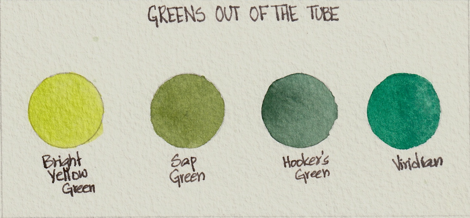
When we begin painting, many of us reach for a ready-made green. Sap Green, Viridian, Hooker’s Green, Permanent Green, Emerald Green — they all look useful and inviting on the palette.
And they are useful.
But used straight from the tube or pan, they can sometimes feel too loud, too artificial, or too uniform. The painted leaf begins to look separate from the plant. The tree looks flat. The bushland loses its atmosphere. The page may be full of green, but somehow it does not feel like the green we saw.
This is not because the colour is “wrong.” It is because real greens are complex.
A leaf is affected by its age, surface texture, the direction of light, the weather, the season, the soil, and the surrounding colours. A young leaf may glow with yellow. A mature eucalyptus leaf may lean towards blue-grey. A dry grass stem may be closer to ochre than green. A shaded area of foliage may contain blue, violet, brown, or grey.
So when we say, “I need green,” the better question is:
What kind of green am I actually seeing?
That one question changes everything.
Australian greens are often quieter than we expect
One of the things I have noticed more and more in my own sketchbooks is that many Australian greens are surprisingly subdued.
They often have a muted quality — a greyness, a softness, a dryness. The greens of eucalypts, wattles, grasses, coastal plants, and bushland edges are often far more subtle than the bright greens we may associate with gardens or European woodland scenes.
There are, of course, bright greens too. After rain, new growth can appear luminous. Ferns and rainforest plants may hold deep, saturated greens. Garden plants may be fresh and vivid. But much of the Australian landscape contains greens that are softened by heat, dust, distance, and light.
I find this especially true when looking at eucalyptus foliage. From a distance, it may appear blue-green, silver-green, or grey-green. Sometimes the leaves catch light in such a way that the “green” almost disappears into a pale, powdery blue or soft neutral grey.
This is where observation becomes more important than assumption.
The mind says: “That tree is green.”
The eye says: “Actually, it is grey-blue, with olive shadows and warm yellow edges.”
That is the moment when painting becomes interesting.
A green is rarely just blue plus yellow
The simplest way to mix green is to combine blue and yellow. This is a useful starting point, and it is often how we first learn colour mixing.
But the result depends entirely on the personality of the blue and the personality of the yellow.
A cool, strong blue mixed with a bright yellow may create a vivid green. A warmer blue mixed with Yellow Ochre may create something more muted and olive. A pale blue with an earthy yellow may produce a soft grey-green.
So instead of thinking:
blue + yellow = green
It is more helpful to think:
this blue + this yellow = this particular green
Each pairing has its own character.
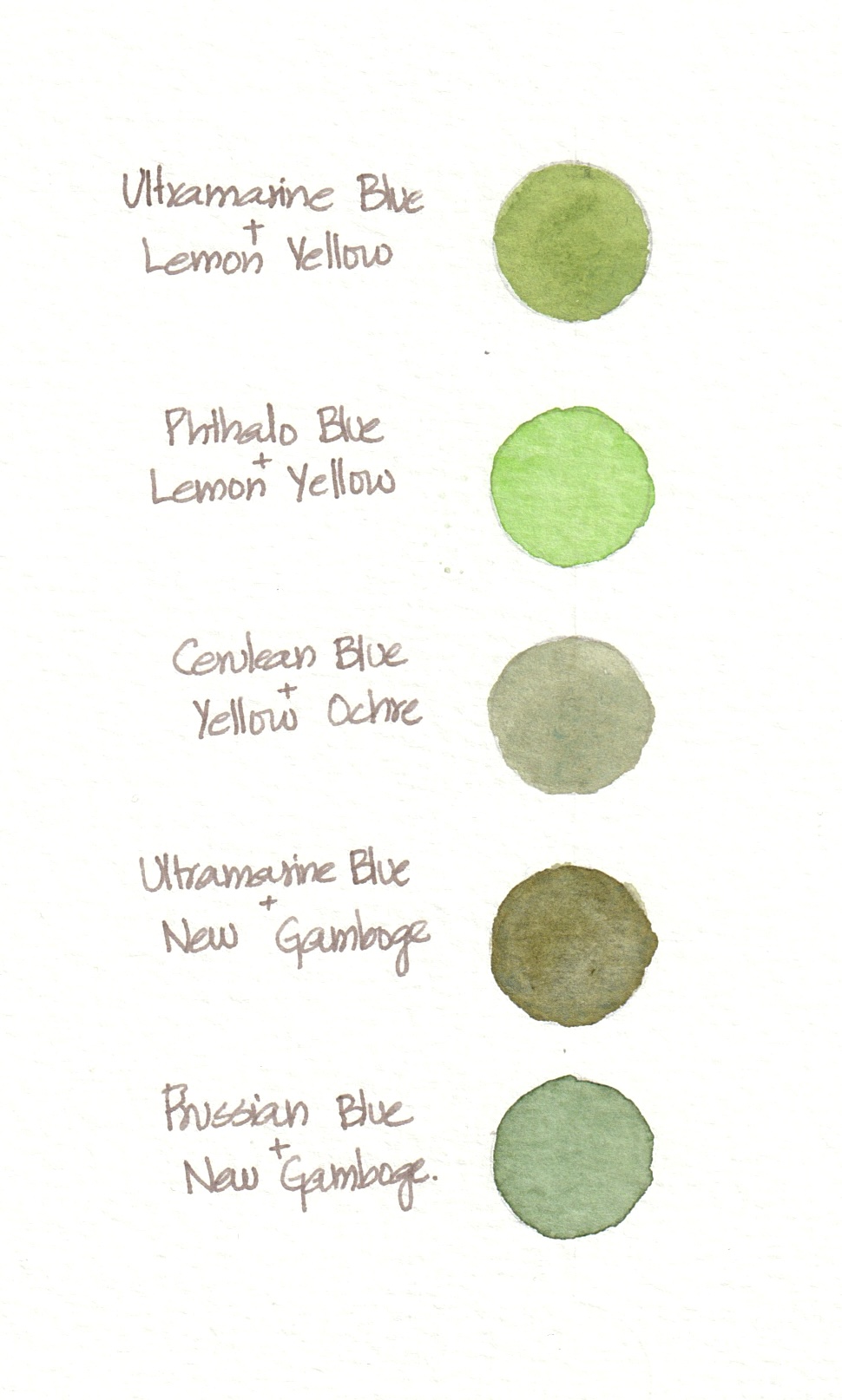
| Mix | Possible result |
|---|---|
| Ultramarine Blue + Lemon Yellow | Fresh but slightly softened green |
| Phthalo Blue + Lemon Yellow | Very bright, intense green |
| Cerulean Blue + Yellow Ochre | Soft grey-green |
| Ultramarine Blue + New Gamboge | Deep olive green |
| Prussian Blue + New Gamboge | Rich, deep green |
This is why a green mixing chart can be so useful. It is not just a technical exercise. It is a way of getting to know your colours.
You begin to see which blues are powerful, which yellows are earthy, which combinations become too sharp, and which ones quietly settle into the colours of the landscape.
The importance of muting greens
One of the most useful lessons I have learned is this:
Most greens become more believable when they are slightly muted.
This does not mean making them dull or lifeless. It means softening the intensity so they sit more naturally on the page.
If a green feels too bright, you can adjust it by adding a small amount of its complement or near-complement. In practical terms, this often means adding a touch of red, Burnt Sienna, Burnt Umber, violet, or another warm earthy colour.
A tiny amount is enough.
This is where restraint matters. If you add too much, the green can quickly become brown or muddy. But a small touch can take away that artificial brightness and create something much more natural.
Some useful ways to mute green:
| Add | Effect |
|---|---|
| Burnt Sienna | Earthy olive greens |
| Burnt Umber | Deeper, duller natural greens |
| A touch of red | Neutralises brightness |
| Violet | Creates shadowy, subdued greens |
| Payne’s Grey | Darker shadow greens |
| Yellow Ochre | Warmer, drier greens |
| Raw Sienna | Natural, sunlit, earthy greens |
One of my favourite discoveries is that a green does not need to remain obviously green to be useful. Some of the most beautiful greens are the ones that sit very close to grey, brown, or ochre.
These are often the colours that make a page feel grounded.
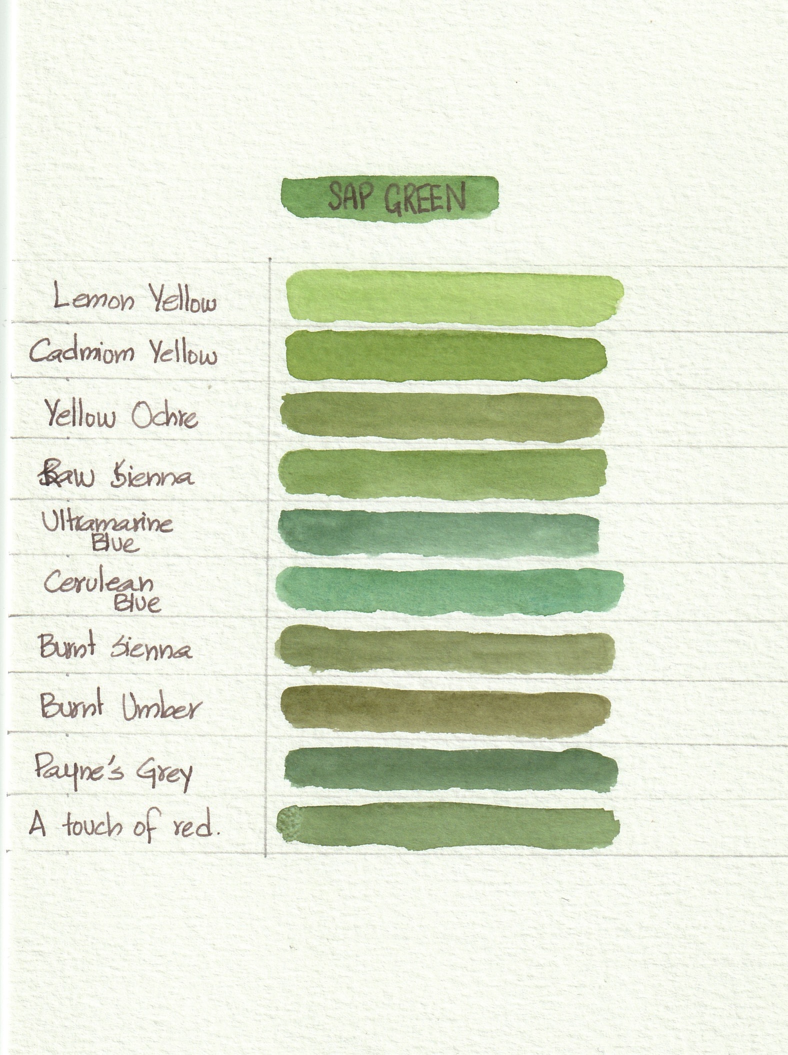
Sap Green: useful, but not the whole story
Sap Green is probably one of the most familiar greens in a watercolour palette. Many artists use it, and for good reason. It is convenient, friendly, and easy to modify.
But Sap Green is best treated as a beginning, not an ending.
Straight from the pan, it can sometimes feel too generic. But once you start adding other colours to it, it becomes much more versatile.
Try making a small Sap Green family:
| Add to Sap Green | Result |
|---|---|
| Lemon Yellow | Fresh spring green |
| Cadmium Yellow or Indian Yellow | Warm glowing green |
| Yellow Ochre | Natural bushland green |
| Raw Sienna | Dry grassy green |
| Ultramarine Blue | Cooler, deeper green |
| Cerulean Blue | Soft blue-green |
| Burnt Sienna | Olive green |
| Burnt Umber | Dull earthy green |
| Payne’s Grey | Shadow green |
| A touch of red | Muted natural green |
This is a wonderful exercise for beginners because it shows that you do not need to own every green. You can begin with one green and learn how to push it in different directions.
A limited palette can still give you a wide range of greens if you learn how to adjust temperature, value, and intensity.
Warm greens, cool greens, and why it matters
When looking at a plant, I try to ask myself whether the green feels warm or cool.
Warm greens lean towards yellow, gold, olive, ochre, or brown. They often appear in sunlit areas, new growth, dry grasses, or leaves catching warm light.
Cool greens lean towards blue, grey, teal, or violet. They often appear in shadow, distant foliage, waxy leaves, or plants with silvery surfaces.
This is especially useful in botanical illustration because even a single leaf may contain both warm and cool greens.
A leaf might have:
- a warm yellow-green along the edge where light touches it
- a mid green through the main body
- a cool blue-green in the shadow
- a darker olive near the central vein
- a greyed green where the surface turns away from the light
Once you begin noticing these shifts, leaves become much more dimensional.
Instead of painting a leaf with one green and then adding a darker version for shadow, you begin to build a more sensitive colour story.
Value matters as much as colour
One of the most common reasons greens look flat is not actually the hue. It is the lack of value change.
Value means how light or dark a colour is.
A beautifully mixed green will still look unconvincing if every part of the leaf or tree is the same value. In nature, light creates structure. The lightest areas, middle tones, and darkest shadows help us understand form.
Before choosing the perfect green, it helps to ask:
- Where is the lightest area?
- Where is the deepest shadow?
- What belongs in the middle?
For botanical work, this is essential. A leaf turns, folds, cups, twists, and overlaps. The colour may be green, but the form is described through value.
For nature journalling, value helps create depth and atmosphere. Distant trees may be lighter, cooler, and greyer. Foreground foliage may be darker and more defined. Shadows under leaves may need deeper, cooler greens.
A simple way to practise this is to mix one green and then create three versions:
- A pale watery version
- A middle version
- A darker version with added blue, brown, or grey
This gives you a small value scale to work with before painting.
Water changes everything
In watercolour, we do not only mix with pigment. We mix with water.
The same green can become many different colours depending on how much water you add. A strong mix may create a deep shadow. A diluted wash may suggest distant foliage, a pale leaf, or light passing through a plant.
This is one of the reasons I love watercolour for botanical and nature journalling work. It allows softness, transparency, and atmosphere.
When painting greens, try not to think only in terms of different pigments. Also explore different dilutions.
Ask:
- What happens when this green is very pale?
- What happens when it is creamy and strong?
- What happens when it is glazed over another colour?
- What happens when it dries lighter than expected?
Many greens become more beautiful when they are allowed to breathe.
The surrounding colours affect the green
A green does not exist alone.
The colour of the sky, soil, bark, flowers, shadows, and nearby plants can all change how we perceive it. A green beside a red flower may look different from the same green beside grey bark. A green under warm afternoon light may look different from the same plant on an overcast day.
This is important in nature journalling because we often paint plants in context. We are not only recording a specimen; we are recording a moment.
The page might include notes about weather, place, season, and light. These observations can guide our colour choices.
For example:
- After rain, greens may appear deeper and cleaner.
- In dry weather, greens may look dustier or more yellowed.
- In strong sun, leaf edges may appear warmer.
- In shade, greens may shift towards blue, violet, or grey.
- At a distance, greens often become cooler and less detailed.
These are the small observations that make a sketchbook feel alive.
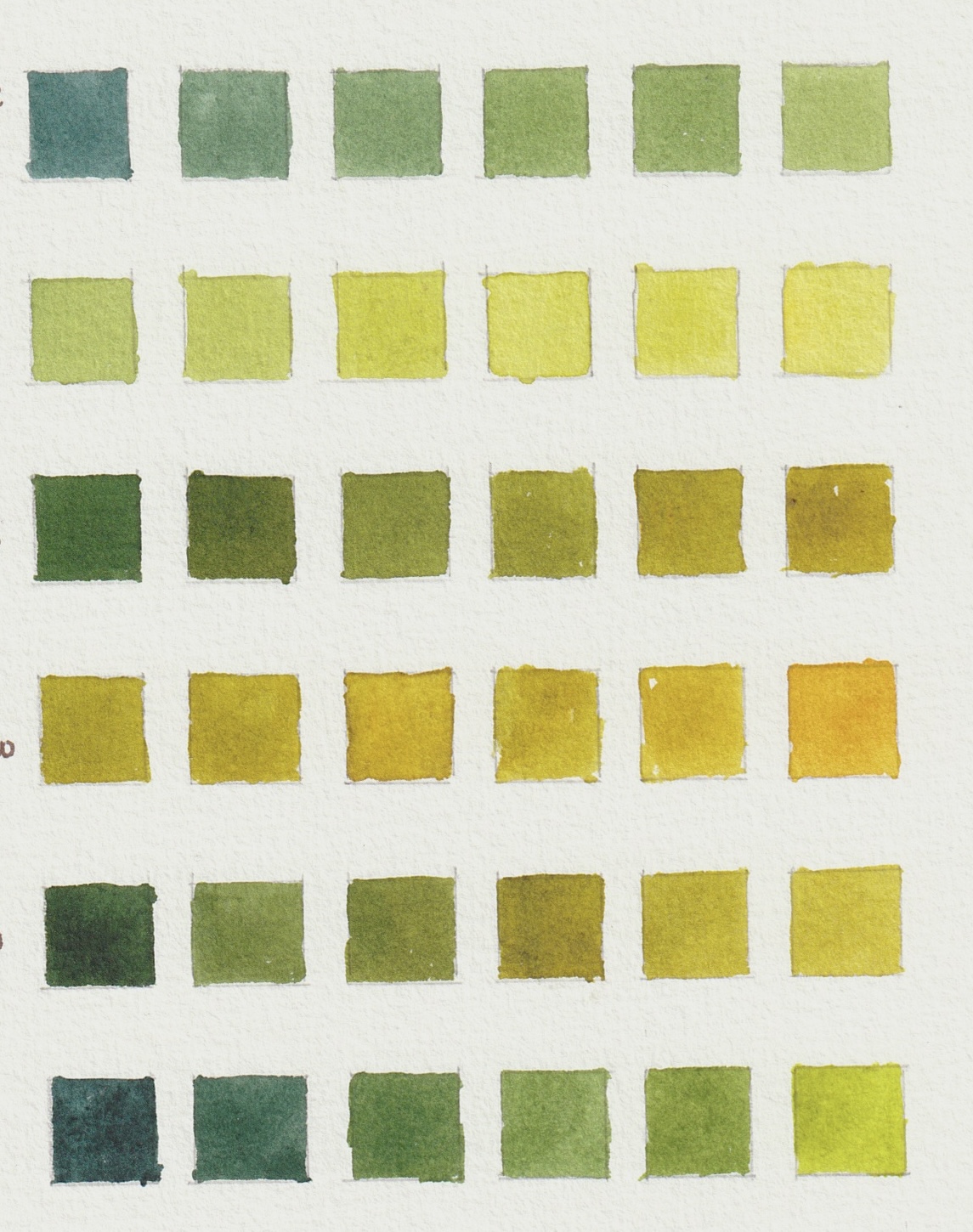
A practical green mixing exercise
Here are three simple exercises you can try after the workshop.
Exercise 1: Blue and yellow families
Choose three blues and three yellows from your palette.
For example:
Blues:
- Ultramarine Blue
- Cerulean Blue
- Phthalo Blue or Prussian Blue
Yellows:
- Lemon Yellow
- Hansa Yellow or New Gamboge
- Yellow Ochre or Raw Sienna
Mix each blue with each yellow and make a small chart.
Do not worry about making it perfect. The aim is to observe.
Notice:
- Which mixes are bright?
- Which are muted?
- Which feel like garden greens?
- Which feel like eucalyptus greens?
- Which feel like dry grasses?
- Which could be useful for shadows?
Make notes beside the mixes. Your notes are just as valuable as the colours.
Exercise 2: One green, many moods
Choose one ready-made green, such as Sap Green.
Paint a row of small swatches, adding a different colour to each one.
Try:
- Sap Green + yellow
- Sap Green + Yellow Ochre
- Sap Green + Ultramarine Blue
- Sap Green + Cerulean Blue
- Sap Green + Burnt Sienna
- Sap Green + Burnt Umber
- Sap Green + red
- Sap Green + Payne’s Grey
This exercise is a lovely reminder that you do not need endless tubes of paint. You need curiosity, observation, and a willingness to experiment.
Exercise 3: Match a real leaf
Choose one leaf from your garden, a walk, or your nature journal.
Spend a few minutes looking before painting.
Ask yourself:
- Is it warm or cool?
- Is it bright or muted?
- Does it lean yellow, blue, grey, brown, or silver?
- Where is the lightest area?
- Where is the darkest area?
- Are the veins warmer or cooler than the leaf surface?
- Is the underside a different colour?
Then try to mix three colours for that one leaf:
- The lightest green
- The middle green
- The shadow green
This is a beautiful exercise because it moves us away from the idea of “leaf green” and towards the reality of a particular leaf, in a particular moment.
My own favourite greens to look for
When I am sketching or painting, I find myself especially drawn to the quieter greens.
- The grey-green of eucalyptus leaves.
- The olive greens in shadowed foliage.
- The yellow-green of new growth.
- The brown-green of dry grasses.
- The blue-green of distant trees.
- The almost-silver green of leaves catching light.
These colours do not always announce themselves. They ask for slower looking.
And perhaps that is why I enjoy them so much.
Botanical art and nature journalling have both taught me that attention changes experience. When we look closely at a plant, we are not just collecting information. We are entering into a relationship with it. We begin to notice its habits, its colours, its small asymmetries, its changes through light and time.
Green becomes less of a category and more of a conversation.
A note for beginners
If you are new to mixing greens, please do not feel that you need to understand everything at once.
You do not need a large palette.
You do not need every green pigment.
You do not need to make perfect charts.
You do not need to know the “correct” formula for every plant.
Start with what you have.
Choose one blue, one yellow, and one earthy colour such as Burnt Sienna or Yellow Ochre. See how many greens you can make. Then take those greens outside and compare them with real leaves.
That simple act — mixing, looking, adjusting — will teach you more than any formula.
Over time, your eye becomes more sensitive. You begin to recognise when a green is too bright, too blue, too yellow, too flat, or too clean. You learn how to nudge it gently towards what you see.
This is the real skill.
Not memorising recipes, but learning how to respond.
Closing reflection
For me, mixing greens has become one of the most rewarding parts of botanical art and nature journalling. It brings together observation, colour theory, memory, place, and patience.
The Australian landscape offers such a rich and subtle range of greens, but they are not always obvious at first glance. They reveal themselves slowly — in the dusty edge of a leaf, the blue-grey shimmer of eucalyptus, the warm olive of dry bushland, the deep cool green after rain.
The more we look, the more we see.
And the more we see, the more our paintings begin to feel connected to the places that inspired them.
So next time you reach for green, pause for a moment.
Look again.
Ask what kind of green is really there.
Then begin.